Background
It has been some time since my last post. Life has taken over, with an infant at home and a hectic work schedule it has been difficult to keep up with hobbies. The goal of this post is really to work through a problem and produce some simple vizualization. I don't want too much dust to pile up.
#imports
import pandas as pd
import matplotlib.pyplot as plt
import urllib.request
%matplotlib inline
Get Data
For this project I used data set provided by the World Economic Outlook (WEO) database maintained by the International Monetary Foundation (IMF). They have a readily available, cleaned dataset that represents a complete economic outlook for all the countries of the world. This data set contains interesting features such as GDP, Population, This was last updated in October 2017.
#Build a function to get the data from the IMF website and save it locally

URL = 'http://www.imf.org/external/pubs/ft/weo/2017/02/weodata/WEOOct2017all.xls'
def get_data(URL):
    urllib.request.urlretrieve(URL, '/Users/wcontractor/Dev/Python/wcontractor.github.io.git/notebooks/WEOOct2017all.xls')
#Run the above function to get the data
#Don't forget to change the path to save this some place local to your computer!!!!!
get_data(URL)
#Read the data into a Pandas dataframe
df = pd.read_excel('WEOOct2017all.xlsx', parse_cols='C:E,G,AN:AX')
df.dtypes
WEO Subject Code      object
Country               object
Subject Descriptor    object
Units                 object
2010                  object
2011                  object
2012                  object
2013                  object
2014                  object
2015                  object
2016                  object
2017                  object
2018                  object
2019                  object
2020                  object
dtype: object
Clean The Data
I noticed all the years of data, which should be number were showing up as objects so I needed to convert them to numeric. I chose to use the apply method to achieve this.
df_cleaned = df_years[[2010, 2011, 2012, 2013, 2014, 2015, 2016, 2017, 2018, 2019, 2020]].apply(pd.to_numeric,errors='coerce')
#Check to make sure the to_numeric method really worked
df_cleaned[2015].sum()
58008139678241.18
df_labels = df[['WEO Subject Code', 'Country']]
df_final = pd.concat([df_labels, df_cleaned],axis=1, join_axes=[df.index])
# Get current size
fig_size = plt.rcParams["figure.figsize"]

# Prints: [8.0, 6.0]
print("Current size:", fig_size)
Current size: [6.0, 4.0]
# Set figure width to 12 and height to 9
fig_size[0] = 12
fig_size[1] = 9
plt.rcParams["figure.figsize"] = fig_size
plt.show();
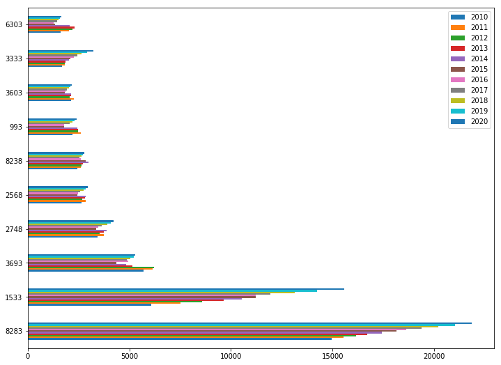
df_final[df_final['WEO Subject Code']=='NGDPD'].sort_values(2010,ascending=False).head(10).plot(kind="barh")
<matplotlib.axes._subplots.AxesSubplot at 0x10cefe048>
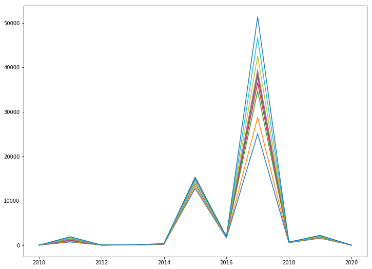
years = [2010, 2011, 2012, 2013, 2014, 2015, 2016, 2017, 2018, 2019, 2020]
plt.plot(years, df_final[years][1:12]);
plt.show();
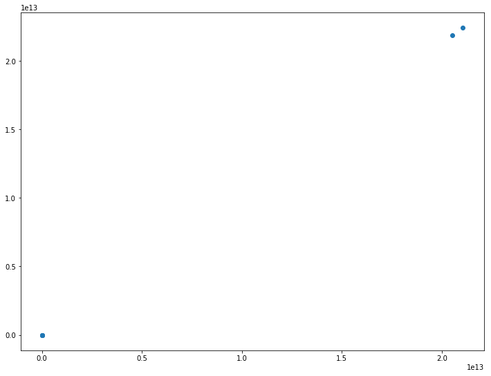
plt.scatter(df_final[2010][1:].sort_values(ascending=False).head(), df_final[2011][1:].sort_values(ascending=False).head())
<matplotlib.collections.PathCollection at 0x1176ed278>